Building a Responsive, Localized Layout System for Charm
| November 28, 2025 |
How I leveraged Next.js 16, Tailwind v4, and next-intl to create a seamless user experience.
Building the foundational layout for Charm required me to balance aesthetic elegance with rigorous technical requirements. I needed a system that was fully responsive, supported dynamic internationalization (i18n), and adhered to a strict design language featuring marble textures and Optima typography.
Here are the three core engineering challenges I solved while building the Header and Footer components.
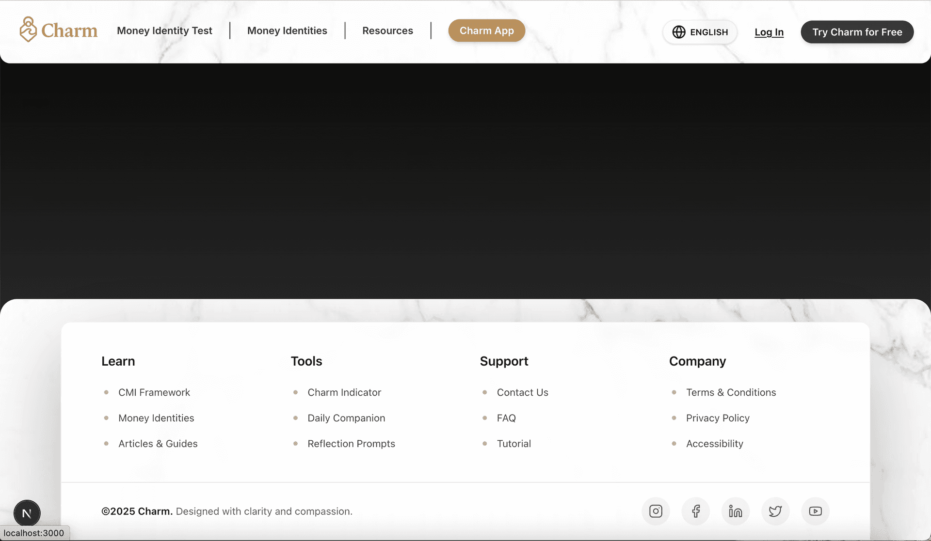
1. Unified Navigation Logic with Split Rendering
The primary challenge in modern navigation is handling the divergence between desktop and mobile interactions without duplicating logic.
Instead of a single monolithic component, I architected a modular solution:
- The Logic Layer (
navigation.ts): I extracted all navigation data (labels, HREFs) into a type-safe configuration file. This allows both the Header and Footer to consume the same source of truth.

- The Desktop View: I built a clean, horizontal
DesktopNavcomponent that utilizes a customNavLinkwrapper. This wrapper handles active-state detection by stripping locale prefixes from the URL, ensuring the “About” tab looks active regardless of whether the user is viewing/en/aboutor/ja/about.
- The Mobile View: I integrated Shadcn UI’s Sheet component to create a fluid slide-over menu. This keeps the DOM lightweight on mobile while providing a native app-like feel.
2. Internationalization (i18n)
Charm supports both English and Japanese, which introduces complexity in routing and state persistence.
I solved this using next-intl combined with a custom LanguageSwitcher component.
- Cookie-Based Persistence: Rather than relying solely on the URL, my switcher sets a
NEXT_LOCALEcookie with a 1-year expiry. This ensures that if a user prefers Japanese, they stay in that context across sessions. - Dynamic Path Rewriting: I engineered the switcher to intelligently reconstruct the current path when toggling languages. It parses the current segments and swaps the locale prefix (e.g., switching from
/en/resourcesto/ja/resources) without forcing a hard reload, preserving the client-side state where possible.
3. Atomic Design & Tailwind v4
To match Charm’s sophisticated brand identity, I moved away from hard-coded styles to a thematic system.
- The “Marble” Aesthetic: I utilized Tailwind’s utility classes to apply our custom marble background image with specific
backdrop-blurandshadow-lgeffects on the Footer and Header. - Typography Tokens: I configured the
Optimafont as a primary variable in our CSS, allowing me to apply brand typography simply by usingfont-primaryacross components. - Component Composition: I built the Footer using a grid system that automatically adjusts from 2 columns on mobile to 4 on desktop (
grid-cols-2 lg:grid-cols-4), ensuring the layout breaks gracefully regardless of screen size.
Moving Forward
With a robust, localized, and responsive layout system in place, the foundation is set. I can now focus on building the core application features—the Dashboard and Money Identity tests—knowing the shell of the application is stable and scalable.